I am one of “those guys” that really leverages his Apple Watch for a lot of tasks, but my main reason for purchasing the Apple Watch Series 1 was for the fitness tracking that included a heart rate monitor on the wrist. I even upgraded to the Series 3 because I wanted the waterproof feature for swimming…and it does an excellent job tracking laps, by the way.
The Apple Watch Activity app, and the more comprehensive Apple Health app, have a wealth of data that will continue to expand as biometric sensors improve. However, users are significantly constrained in terms of how they can view the data. As I continue to build out a Tableau Public portfolio, I thought I would have some fun building a Tableau DataViz on exported data from both Apple Health and TrainingPeaks (another app I used when training for a half-marathon). Here are a couple interesting features for this DataViz:
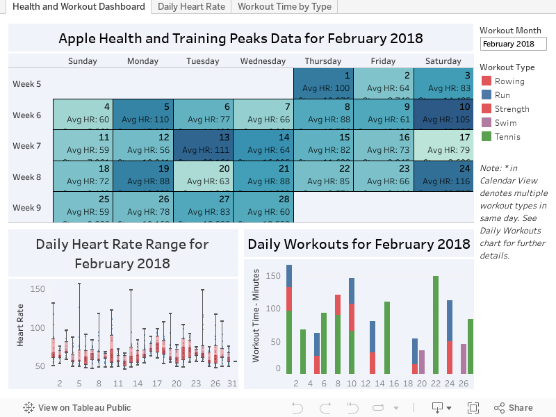
1. No Calendar chart type – no problem
It seems like a calendar view of data would be a common request; however, Tableau does not have a Calendar “chart type” option. The good news is that Tableau has such great data visualization flexibility to allow you to quickly build a calendar view.
- Step 1: Identify the date dimension that will be used for the calendar.
- Step 2: Drag this date dimension to the Columns shelf, and use the context menu to select More ▶︎ Weekday. Within the same context menu, ensure Discrete is checked (versus Continuous).
- Step 3: Drag the same date dimension to the Rows shelf, and use the context menu to select More ▶︎ Week Number. Within the same context menu, ensure Discrete is checked (versus Continuous).
- Step 4: Drag the same date dimension to the Label shelf. By default, the display format will be set to YEAR. Use the context menu to select Day. We can then click on the Label shelf – and choose the ellipses next to the Text option – to apply formatting, or add more columns and text for further details for each calendar date. In my case, I dragged the date dimension, average heart rate, sum of the step count, and workout title to the Label shelf.
2. Single parameter for multiple sheets
The main dashboard, in this data visualization, uses sheets leveraging data from two different datasources (both Apple Health and TrainingPeaks data). To simply the user experience, users should only select the “Workout Month” a single time versus for each sheet on the dashboard. If the same date columns were available in each sheet, then we could just set the Calendar View to act as a filter for the remaining sheets on the dashboard. However, the sheets have different date dimensions…so we need an alternative to accomplish the same intuitive efficiency in the user experience.
Defining a Parameter and displaying a Parameter Control are perfect for this scenario! Here are some high level steps after first selecting one of the sheets we intend to use on the dashboard.
- Step 1: Right click on the Data pane and select Create Parameter.
- Step 2: Name the parameter and define the Data type, Current value, Display format (this example uses “Mmmm yyyy”), and Allowable values. Because I only wanted to view data going back to when I started tracking in BOTH Apple Health and TrainingPeaks, I did set a Minimum date. Then, specify the Step size. In this case, we want Months since we are viewing daily data for the selected month.
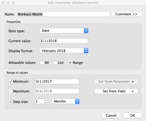
- Step 3: Right click on the Data pane and select Create Calculated Field.
- Step 4: Give the calculated field a meaningful name (we went with Apple Health Month for this example), and then enter the expression: DATETRUNC(‘month’, [Calendar Date]) = [Workout Month] where “Calendar Date” is our date dimension and Workout Month is our parameter.
- Step 5: Drag the new calculated field over to the Filter shelf, and ensure the “True” checkbox is checked in the Select from List values.
- Step 6: Click on the context menu, for the new parameter, and select Show Parameter Control.
- Step 7: Repeat steps 1-6 for each sheet that can leverage this new parameter/calculated field combination.
If you want to check out this interactive DataViz, you can either (1) experiment with the embedded data visualization below…even clicking on the Full Screen option in the bottom right corner, or (2) visit my Tableau Public profile.
Thanks for stopping by the Analytic Integrity website for another DataViz Demo. I am evaluating several intriguing datasets for the next data visualization including nutritional values for most common foods in a grocery store as well as data that a local charity tracks in regard to the homeless population.
If your company is ready to derive value from a wealth of internal data, or wants a kickstart in evaluating “what is possible” with a BI/Analytic Assessment, send me an email or fill out the Analytic Integrity contact form.