With the Number 1 pick of the 2018 NFL Draft, the Cleveland Browns select…Baker Mayfield! Wait – what?!? The irony is that most of the Browns’ fans were frustrated with picking a polarizing quarterback at #1 – and then still not getting Bradley Chubb at #4 – when I hoped the Denver Broncos would get a chance at Mayfield, and the Broncos ultimately selected Chubb!
The NFL Draft offers passionate fans an opportunity to celebrate, or lament, with each other even during the offseason. As an NFL fan, I could not pass up the opportunity to one-up my 2017 NFL Draft Tableau data visualization with an updated version with 2018 NFL Draft results. Of course, this dataviz also showcases a couple more Tableau capabilities on the featured dashboard!
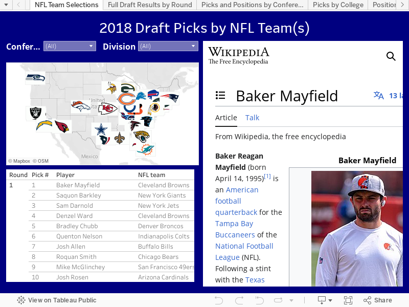
1. NFL Team Logos as Custom Marks
We’ve all seen charts with “marks” like points, circles, crosses, and “x marks the spot” to represent data points. Tableau can also leverage custom marks. What better way to showcase this, on an NFL-centric dashboard, than using the team logos to represent the map location of the NFL teams. Fans can use the Conference and Division dropdownlists to narrow the results to the AFC or NFC conferences – or pick the Division to quickly see their team…and their spirited rivals…on the map.
Clicking on a team logo on the map will narrow the draft picks displayed at the bottom of the dashboard. Hovering over a team logo will provide summary information regarding the team.
2. Draft pick Wikipedia entry with Embedded Web Page
When I’m reviewing draft results, I visit BleacherReport, ESPN, and the official NFL websites. Each has good information and analysis. In this custom dashboard’s case, I’m looking for a non-busy user experience. As fans click on a draft pick, from the results at the bottom of the dashboard, the player’s Wikipedia entry will appear on the right hand side. The advantage of Wikipedia is that it provides a more exhaustive background on the player (personal life, high school and college career, awards, etc).
Tableau makes it very easy to embed web pages on a dashboard. As you can see, developers are not limited to static web pages. In this case, each player selection pulls up the appropriate webpage matching the player. Hat tip to Wikipedia for providing the 2018 NFL Draft page with hyperlinks on the player names. I applied a little data cleansing and transformation, in Excel, to include the hyperlink addresses as a separate column in the dataset leveraged by this Tableau dataviz.
The rest of this Tableau dataviz, viewable directly on my Tableau Public profile, follows the same structure as my 2017 version. It includes tabs for (1) Full Draft Results, (2) Picks and Positions by Conference, (3) Picks by College and (4) Positions by Round. Each tab is loaded with filtering capabilities as well as Viz in Tooltip information simply by hovering over – or clicking on – different portions of the dataviz. For example, depending upon the tab, hovering will show other draft picks for the same position, or from the same college/conference, or for same position in the NFL draft round.
Keep stopping by the Analytic Integrity website for more DataViz Demos. My next public dataviz may experiment with using health data from a couple different datasources – TrainingPeaks and Apple Health data.
Does your company need assistance telling a creative, compelling, and *correct* story with your data? Do you simply need a BI/Analytic Assessment to get the ball rolling on your data-driven maturity journey? If so, send me an email or fill out the Analytic Integrity contact form.