In preparation for the 2018 NFL Draft (April 26th – 28th), I thought it would be fun to prepare a Tableau Data Visualization (DataViz) on some of the data available from the 2017 NFL Draft. Expect an update on this post as the 2018 Draft results are finalized.
Tableau has exceptional visualization capabilities, and future DataViz Demo posts on this site will demonstrate more varied chart types or filtering capabilities. However, I built the embedded DataViz from an NFL fan standpoint – staying true to Joe Friday’s manta: “Just the facts, ma’am.”
1. Full Draft Results by Round
I actually chose the fourth tab in the workbook – Positions by Round – to be the featured image because it is more visually compelling. However, this first tab provides the pick-by-pick results for fans who didn’t have time to sit through an entire draft to see their favorite team’s selections…as well as the selections of rival teams. Fans can scan through this list to see how the draft unfolded, or they can use the filter on the right to quickly view their team’s selections.
Hovering over the Notes column will pull up a nifty Tableau feature – called Viz in Tooltip – to see other draft picks for the same football position (quarterback, wide receiver, etc.).
2. Picks and Positions by Conference
When football fans review draft results, they also like to see how well their alma maters – and their associated NCAA Conference – did in the draft. You can bet the SEC alumni review how many defensive ends and cornerbacks came out of their conference. They then enjoy pointing out the number of draft picks their conference produced versus the other “Power 5” conferences (ACC, Big 12, Big 10, and Pac 12).
This visualization not only displays the total number of draft picks per conference. It also breaks that number down by the number of picks for each of the football positions. Hovering over any of the colored bars will display the drafted player names corresponding to that conference and football position. Tableau is clever in allowing reuse of the same sheet for the “Viz in Tooltip” even though passing along different filter criteria depending upon the source visualization.
3. Picks by College
Here is where football fans get a geographic breakdown of the NFL draft. Fans will pick their own alma mater, to again see draft positions for all of their players that “made it to the next level”. However, this dataviz also uses bubble size to quickly illustrate which colleges are producing the most draft picks. Fans can also use the slider on the right to narrow down the schools with the most picks – which are the usual culprits (Alabama, LSU, Michigan, Florida…and Utah??).
Hovering over a bubble will provide that Viz in Tooltip to list all of the draft selections for the selected university/college.
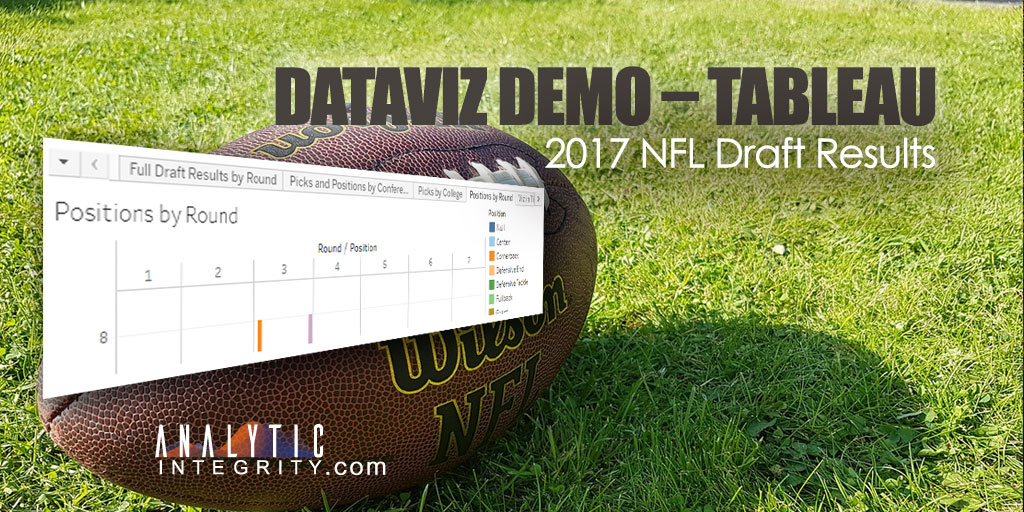
4. Positions by Round
2018 is anticipated to be a “quarterback heavy” draft – with 4 out of the top 5 picks likely to be franchise-quarterback hopefuls. However, 2017 looked to be light on quarterbacks and heavy on defensive ends.
Fans can hover over any of the vertical bars to see a list of players drafted for that position, for that round. Selecting a football position, on the right hand side, will highlight the vertical bars corresponding to that position – for each draft round.
I do hope that you’ve enjoyed this light-hearted, fan-focused DataViz Demo – the first one posted to the Analytic Integrity website! Do stop by the Analytic Integrity website for more DataViz Demos as I see opportunities to use publicly available data to generate interesting, interactive, and compelling data visualizations.
And if you need help creating compelling data visualizations for your company data, or assessing (1) where you are and (2) where to begin in regard to leveraging your company data, send me an email or fill out the Analytic Integrity contact form.